Graphs to stick on your wall

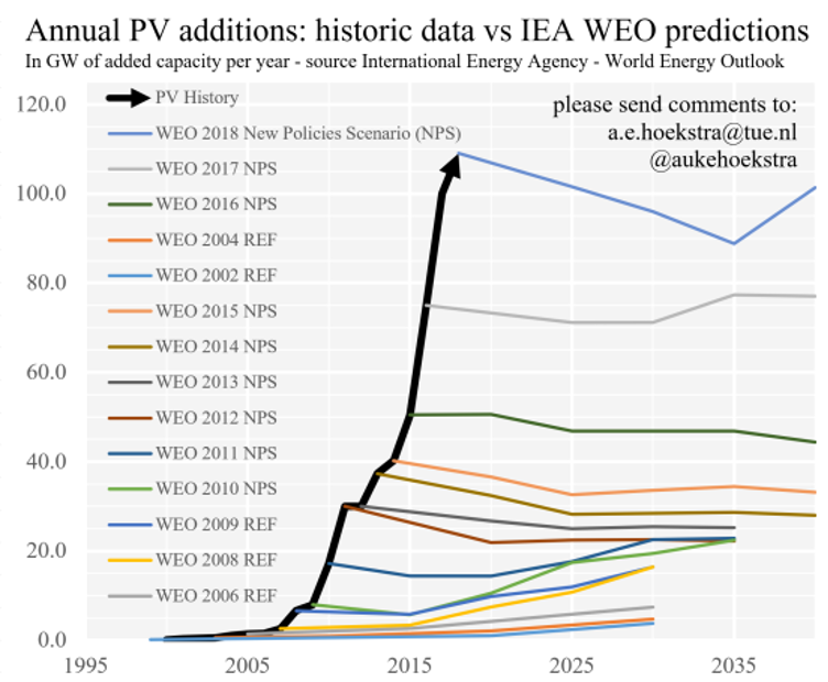
I have a friend called Mentor (his real name), and many months ago now he was showing me around his new apartment. When we were in his office, he pointed out a graph that he had stuck on his wall, this was that graph:

I loved this. I’ve written before about producing things, the influence of tactile things, and how your environment informs behaviour before, and this was such a good example of all those things.
Mentor had read an article that had inspired him and so he printed it out and stuck it on his wall for inspiration. He also unknowingly stuck it on the inside of my mind.
Fast forward several months to December 2024, I went to an event about climate solutions. I found it through a couple of ex-colleagues and it was hosted by a different ex-colleague Celia.
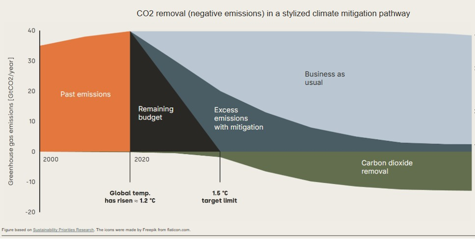
One thing stuck out more than the rest. One of the presenters, Oscar Rueda from South Pole was presenting about carbon removal technologies and put this graph on the screen:

When he went to move on to the next slide an event moderators, Thom Beumer, stopped the presentation to ask if anyone in the room wanted the graph to be explained.
He said, ‘I think this is the most important graph in climate right now.’ I loved this sentence.
For someone to have a favourite graph, or to say a graph is important it means they 1. At least think they understand the data, 2. Likely feel strongly about the topic that the graph is visualising, and 3. They’re a nerd. All good things.
The following week I wrote a ‘fact check’ article for work where I re-discovered ‘our world in data’ (OWID) a website and tool that I’m in awe of every time I see it.
They make incredible data visualisations, and report on important things, but also, look how pretty it is!! (They have a ‘grapher’ tool to make use of their tech. I’m trying to get it working on my Mac right now otherwise I’d have used it for this. It doesn’t play well with Apple silicon yet).
OWID features heavily in a lot of articles I read and in the email newsletter ‘ we’re here’ from vlogbrothers, this was the final sign (good things come in threes). I decided it was time to do something with cool graphs and data.
I then fell off that particular train for good reasons, but now we're back, once again inspired by a video about a graph:
I’m going to start a little blog series called ‘Graphs to stick on your wall’. I’ll collect people’s favourite graphs, verify the data, maybe recreate it with OWID’s grapher, and talk about what makes it cool or inspirational.
If you have a favourite graph, or one you think is the most important graph in `some industry` reach out to me with the graph and tell me why it’s great. I’ll take care of the rest. I’m going to start with the two graphs mentioned above.

