Solar capacity - sticky graphs

This, is my friend Mentor’s favourite graph:
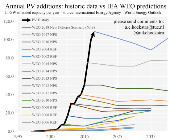
It shows that between the years 2006 and 2018, when the International Energy Agency (IEA) made projections about the future capacity of photovoltaic cells (PVs) - solar panels - in their report ‘World Energy Outlook’, they were, year after year, very wrong.
In fact, the capacity of PVs increased … dramatically. Let me explain.
Why it inspires
The coloured lines that plateau out to the right of the black arrow are the predictions from one of the world’s leading institutions on energy data. They made these predictions using data from the previous year’s capacity, and to-date policy data from countries across the world in order to answer the question ‘if this all stays true, what will happen to PV capacity next?’
The lines show that in every year since 2002, (excepting 2007) they expected the PV industry not to grow, or not by much, but instead to plateau.
The black arrow on the graphs tracks what actually happened.
As you can see, every year (except maybe 2012) additional PV capacity drastically increased more than projected.
This in and of itself is great, more solar capacity, more better. But it’s more interesting than that. This means that every year something happened in the ‘PV industry’ that wasn’t accounted for in the predictions. Perhaps countries changed policies to have a greater effect, maybe manufacturing practices became cheaper, whatever, it’s show that something happened and the PV capacity for the year got way bigger.
AKA solar panel energy capacity has been growing dramatically despite policy and legislation – pretty, damn, cool.
That’s the ‘explaining the graph part of the article done, the rest is going to get nerdy. Hold on tight.
Fact-check
Okay, when you see data like that, a good and healthy bit of scepticism is always worthwhile. Is the data accurate? Is it being presented in a way that biases the reader? Is it misleading in some way? All good questions, well done.
To answer them, the best thing to do is to try to recreate the graph. I went to the original post, found the data sources he referenced, and got to reading. It took a while (one very late evening) to understand what was going on and where the data came from.
World energy outlook reports
The WEO reports are massive – hundreds of pages long and dense with information – put together by a small army of researchers covering pretty much everything you would expect from a report titled ‘world energy outlook’. It’s amazing.
Their design, though improving, could use some work and it’s not the most approachable - I, with a technical degree who has worked in this kind of thing for a while had to take more time than I would like to admit to understand what I was reading, but once I did, it was great.
The data for the graph from before comes from tables that are always at the end of the report in the Annex, on pages that are always titled something like ‘World electricity sector’, in tables titled ‘Total capacity’, measured in GW (gigawatts) that give the previous and projected capacities for renewable energy sources (including PVs), nuclear, hydrogen and ammonia, fossil fuels with CCUS (carbon capture utilisation and storage), unbated fossil fuels, and battery storage.
This is the table from the 2023 report for example:
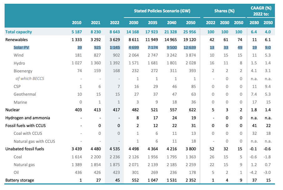
The line I highlighted in the image is where, for each year, all the data came from for the graph. There's a lot of data in these reports. Again, it's amazing.
Data accuracy
So now we have the data, first, is it representative (is what the graph is saying that it’s saying really what it’s saying)? And then, do the calculations that we need to do to plot the graph really work?
Is it representative?
This was easy to check. The author of the original blog post not only extracted and plotted the data we’ve talked about but also extracted insights from the main bodies of text. This meant that to figure out if what they were saying is true, I only needed to search for what they said and verify the context.
Reading through the reports I found a few very small mistakes in the data given in the blog post, probably rounding errors or errors on my part (more likely my mistake than the PhD researcher author) since they were so small. But otherwise, everything checked out. Below are some screenshots from the various reports that validate claims made in the original blog post.
- WEO 2004 is verifiable:
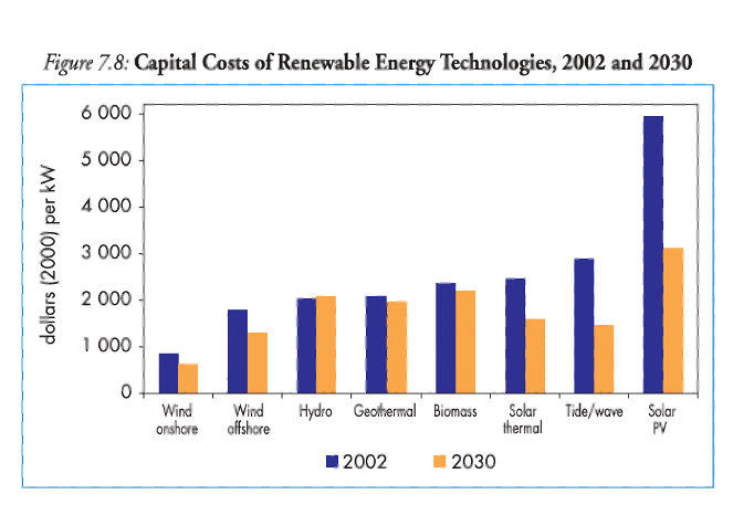
- WEO 2008 is verifiable

- WEO 2012 is verifiable
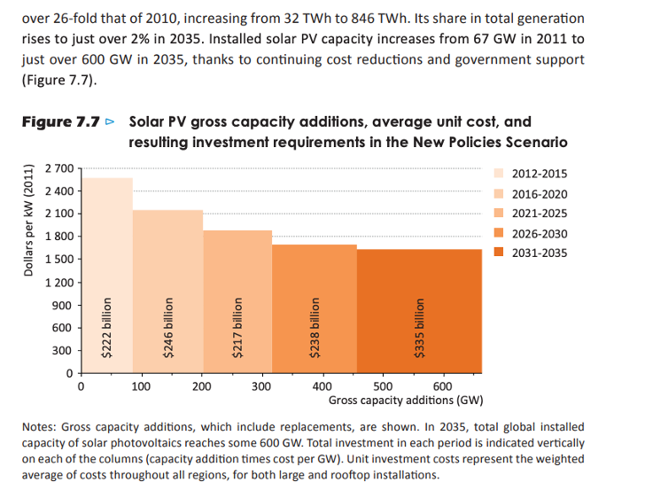
- WEO 2017 is verifiable
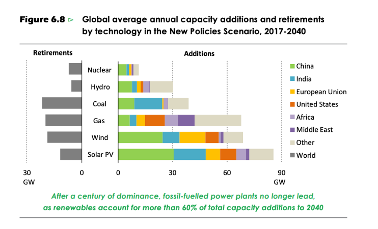
So. The claims check out. Great, our inspirational graph remains inspirational.
Do the calculations check out?
Just like the best way to fact check a graph is to try to recreate it, the best way to check someone’s calculations is to re-do them. This is what the author of the original article did to get the data points:
“If we want to predict if factories open or close we should look at yearly additions. We can make a close approximation (a first order derivative in mathematical terms) by taking the difference between years in the previous table and by dividing that difference by the number of years.
E.g. the WEO2016 predicts that between 2020 and 2025 the installed capacity will grow from 481 to 715 gigawatt. That means that in those five years 715-481= 234 GW will be added. That is (on average) 234/5= 47 gigawatt per year. Applying this method we can see that the WEO predictions become very stable.”
So we take the capacity in the previous year, subtract it from the capacity in the predicted year, and divide by the year difference. Nice and simple. Collecting up all the data from the reports, and wacking them in a spreadsheet, indeed almost all of the data points matched exactly (with some very minor exceptions noted previously).
Recreating the graph
With the data validated, all that was left to do was to plot the data and check it looked the same using my trusty friend Jupyter notebook, this is what I got:
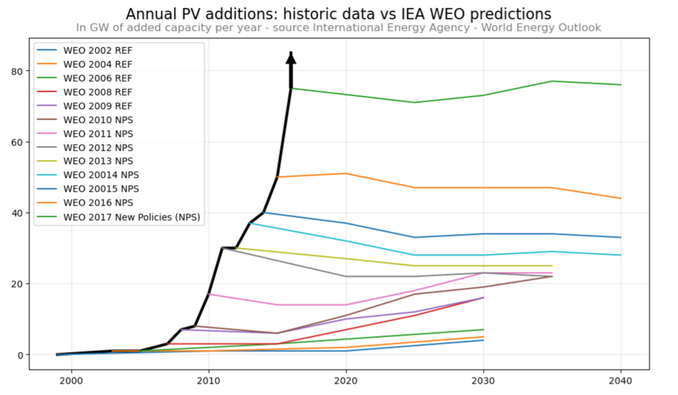
It’s not the prettiest, especially the arrow but I haven’t got the OWID grapher tool working yet and it’s been a while since I’ve used Jupyter notebook so shut it.
So, the data was right, the plot was good. Nice. A good, inspirational graph.
Updating the graph
But when I started interpreting the graph I noticed what you probably noticed too, it only goes up to 2018. This is because the original article that described the graph was written in 2018 and then updated in 2019. Bummer, right? What happened next? Did it continue to grow? Well, let’s see.
The WEO reports didn’t stop in 2019 and they’ve been cracking them out every year since the graph was originally published. So, let’s update the graph.
Disclaimer: if you read or have read the original article, it’s very good, and with each WEO there is an analysis and sometimes criticism of the report’s findings and methods. I started doing this too but quickly realised I don’t have the motivation, so I stopped. After 2019 my commentary is much simpler.
WEO2018 states: ‘Solar photovoltaics (PV) are cheaper than ever; yet there are signs that near-term deployment of new solar capacity might be slowing.’ – Similar to the WEO 2017 report this statement doesn’t reflect the data later in the same report, but this time, in the reverse.
This statement alludes to a slowing down of solar capacity but the same graph referenced by the author(s) in 2017 was given again in 2018 and clearly shows they’ve noticed the step up in additional PVs ,and reduction of retiring PVs. Strange from the WEO but starting to look better for accurate predictions.
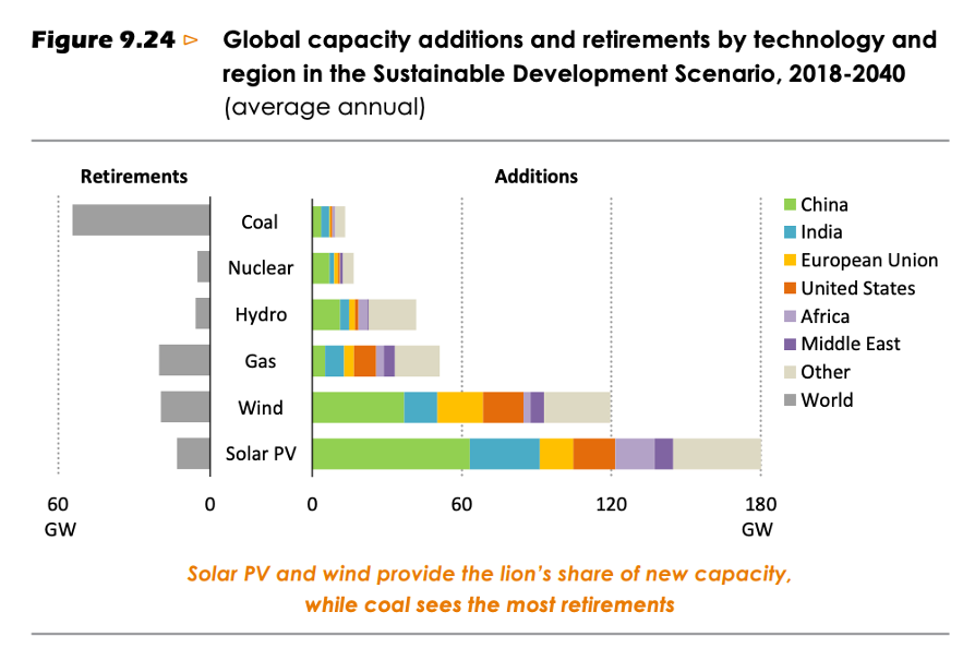
There is a warm fuzzy feeling in the report though as it is stated several times throughout that in this new policy scenario prediction solar will outcompete coal in power generation by 2040:
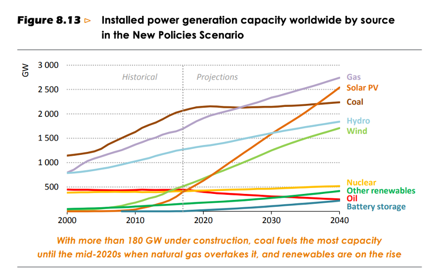
Another graph that would be worth verifying I think - on the basis that it’s awesome.
WEO 2019 states: “This year brings many changes. I would like to highlight two in particular. First, we have renamed the New Policies Scenario as the Stated Policies Scenario, making more explicit the intention to “hold up a mirror” to the plans and ambitions announced by policy makers without trying to anticipate how these plans might change in future.”
To me this statement feels like a response to the OPs article - meta, I know. It feels like someone read OPs article and changed the of the data. For what it’s worth, I’m glad they did, the new name is more descriptive. Though the follow up statement did come across a little defensive:
“The Stated Policies Scenario, previously called the New Policies Scenario, is not an IEA forecast. It takes into account policies that have already been announced (“stated”) but does not speculate on how these might evolve in the future. The new name of this scenario in WEO-2019 has been chosen with the aim of avoiding misunderstanding on this point.”
But that’s okay too, I suppose they weren’t too happy about the criticism even if it led to a very inspiration graph.
WEO 2020
We’re missing 2035 this time and they added ‘2010’ to the table presumably to show how far they’ve come from 40GW in 2010 - although looking back at the 2012 table that was the first to have the real data for 2010 you can see that it was actually 38GW in the NPS table – I assumed this was a rounding error, but no, it’s the start of a saga.
WEO 2021
Projection dates change again, but this time adding 2050 – is this the future?! Nice. They also state 2010 again, for reference, but this time we know it’s not a rounding error as they’re saying 39 in 2010, so I’m not sure whether 2020, 2021, or 2012 is more accurate for 2010 :shrug:
WEO 2022
2010 is again listed as …. 39! Yay, we’ve settled on one. Anyway…
WEO 2023
2010 is 39 again so that’s not exciting but we see the return of 2035 which is nice.
WEO 2024
2010 is up to its old tricks, it’s back up to 40. What’s going on WEO?! Is this an oversite? Is more data about 2010 coming in? Do you have a time machine and are changing PV energy capacity in 2010?
Anyway, after adding all the other years, here’s the final, updated graph:
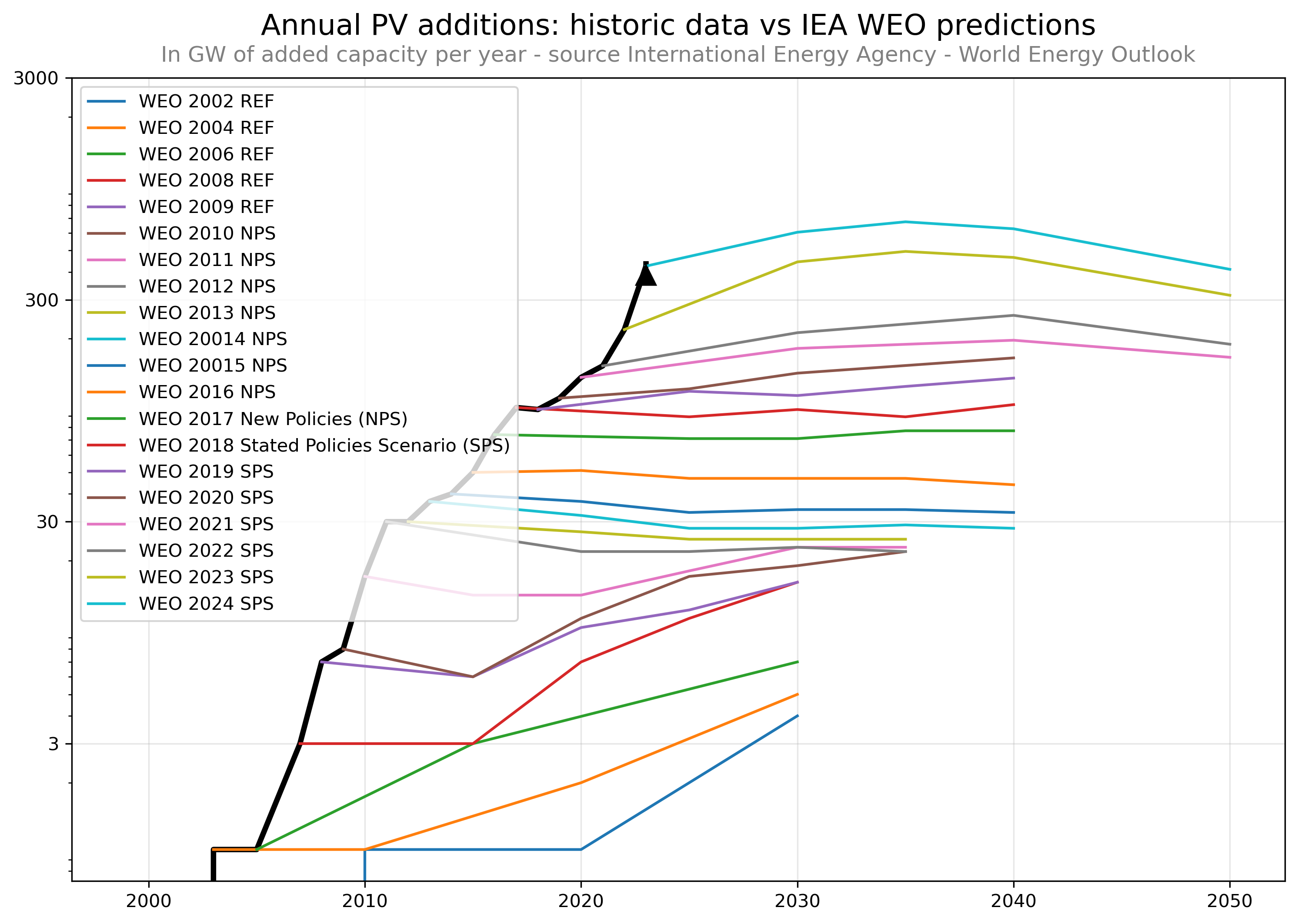
Discussion
To wrap up this long post there’s a couple of things I wanted to mention. First, the person who created this graph and published the original article expressed some frustration at the WEO and seemed to conclude that the graph also showed that in this particular regard, the IEA WEO people were being stupid or complacent.
His argument amounted to ‘How can they be getting it so wrong!?’ I can understand why he might think that, and when he took to Twitter about it and the IEA tried to defend themselves, they didn’t do a good job. But that’s okay, they’re awesome data analysts, not debaters.
But it all feels like a misunderstanding. The original author noticed that the predictions plateaued and seemed very conservative as forecasts, and so he put the graph together to show the reality. Leading to inspiration and the creation of a graph that lives rent free in my friend Mentor’s office.
However, this does seem like a misunderstanding of the WEO’s intentions and I think the same misunderstanding that encouraged the changed name from ‘New Policies’ to ‘Stated Policies’. They’re not trying to forecast or project, with the data that they use their trying to say, ‘this is the difference existing policies will make.’ There’s a difference.
The difference is what I think makes the graph all the more inspirational: PV capacity increases drastically despite policy.
Secondly, the ‘updated’ graph I produced above looks very dramatic too, but in a different way. The trend set in the original graph carries on until 2022, the predictions continue to plateau, that continue to be surpassed.
But in 2023 and 2024 the predictions buck the trend and rise at a rate more like the actual happenings we’ve discussed. And then in 2035 we see the political anticipation of the peak and the first major decline in predicted PV capacity. Which is to say policy is catching up ... POLICY MIGHT BE CATCHING UP?!?
