System change through multi-level perspectives - sticky graphs
Another stick graph - a framework showing how complex systems actually change through three interacting layers. It's messy, non-linear, and (but) useful for understanding system change.

This is my pal Hanna’s favourite graph:

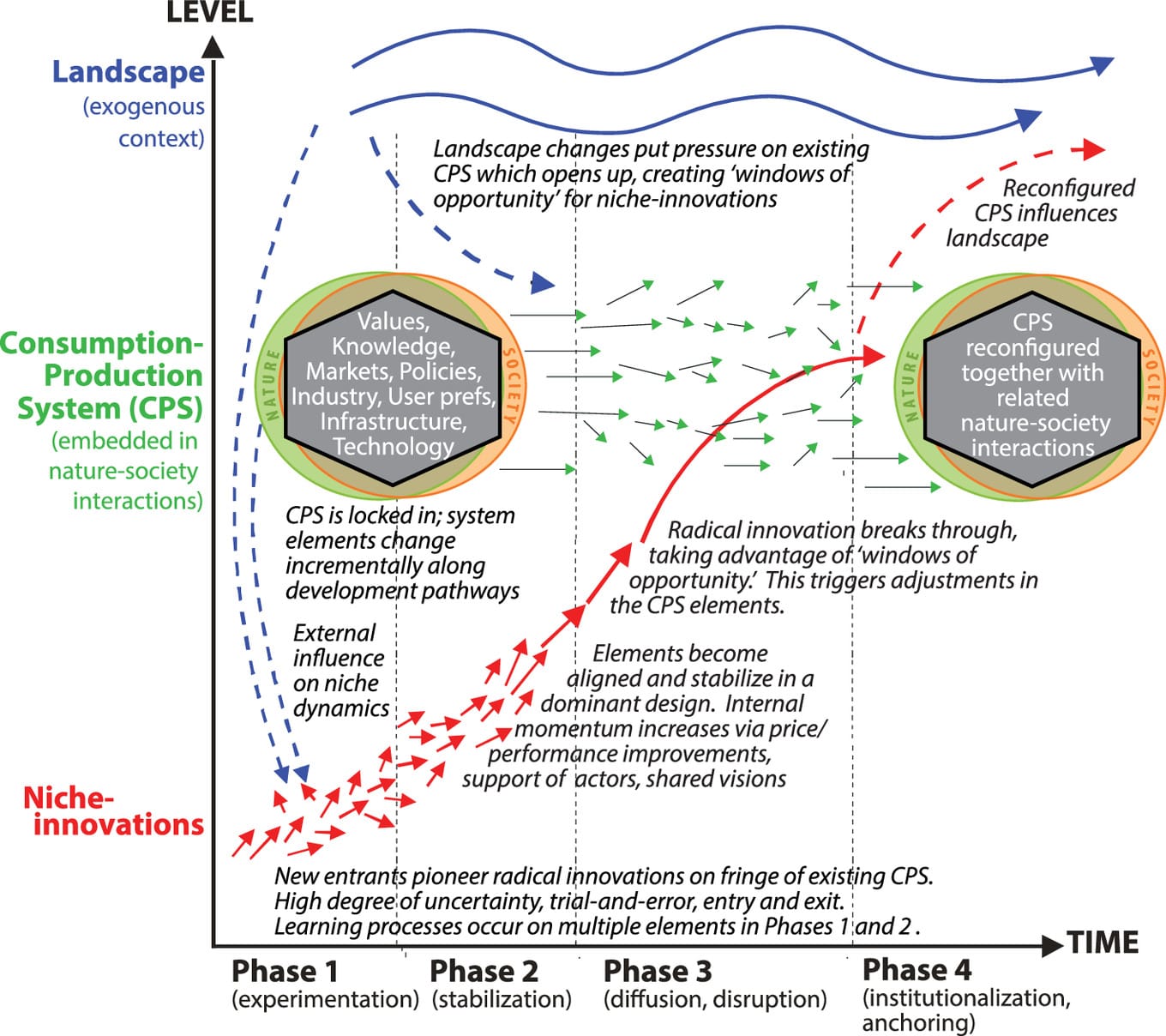
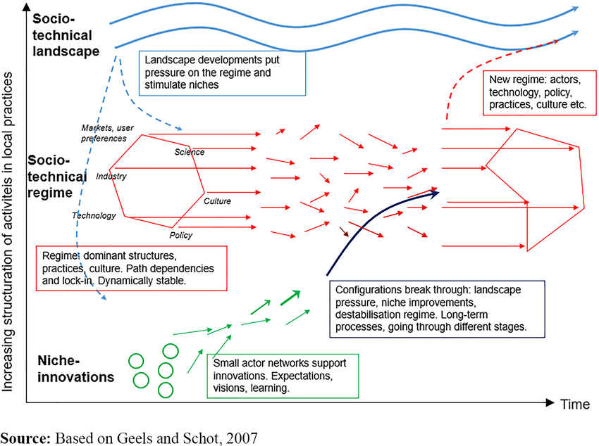
As graphs go, it’s quite scary, but fear not, it’s actually really cool. It shows the three layers of change that can happen in any given system or industry.
Each one operates at different speeds and scales. At the top, there’s the slow-moving landscape forces that create pressure on established systems. In the middle, consumption-production systems (CPS) that resist change until pressure becomes overwhelming. And at the bottom is where innovations emerge in niches, most failing, some stabilising, until their breakthrough moments arrive.
It puts forward that the timeline moves through four distinct phases:
- Experimentation sees multiple niche innovations emerge whilst the established system remains stable.
- Stabilisation allows some innovations to gain traction in protected markets.
- Disruption occurs when landscape pressure destabilises the established system, creating windows of opportunity for proven niche innovations to scale.
- Institutionalisation sees successful innovations become the new dominant system.
Green arrows show incremental pressure from landscape to system. Red arrows show radical innovation pressure from niches.
The system itself shifts from locked-in stability to fundamental reconfiguration as these pressures align.
Hanna was telling me she “likes this graph because it’s chaotic - it’s more representative of reality than a lot of frameworks that try to pretend these things are clean cut, VBN for example. Whereas this MLP graph is super non-linear and recognises the holistic, chaotic nature of things and allows you to root for the little guy, ripples to waves. “
“I think it also shows you can’t approach system change from a silo, but if you work in any of the main elements of the regime you can contribute to regime change, which is empowering. So many times people think you have to be in policy to affect change, but no, this is saying you can attack the system from any of these points and if you’re successful it’ll bleed into all elements of the regime.”
I told you it was cool. But why should we believe it? Is it just a bunch of lines and arrows.
MLP graph background
Frank Geels developed the multi-level perspective framework in the early 2000s at the University of Manchester, building on evolutionary economics and science and technology studies. The framework emerged from studying historical transitions in transport, energy, and water systems - cases where entire socio-technical systems had transformed completely.
Geels noticed that standard innovation theory missed something. Most frameworks focused either on individual technologies competing in markets, or on broad social forces. Neither explained how whole system transitions happened.
The MLP framework bridges this gap by showing how change occurs through the interaction between the three levels. Landscape developments create selection pressure. Technological niches provide variation. And socio-technical regimes provide retention and stability.
The framework has been applied extensively in sustainability transitions research. The oens most easily Googled for are: use in Dutch energy transition policy, use in German energy transition applications, in food system research, and in certain policy assessments in general.
I gather from quickly reading through this research that policymakers use it to understand how to nurture promising innovations whilst creating pressure for system change.
It seems quite simple when you think about it like that, and hopefully now the graph is less confusing, but of course, there’s a lot more to system change than nurturing promise and creating pressure.

How this helps us understand system change
So it’s a well used graph, a well used framework. Now let’s talk about what we can learn from it. If we accept it as true we can use it to explain things that have happened, or plan things that could happen in a given system.
Perhaps more than anything else the framework suggests that changing individual system components in a silo won’t drive system transformation. That all elements - technology, markets, policies, user preferences - are linked.
According to this logic, optimising one component that’s already a part of the system, whilst leaving others unchanged would maintain overall system stability rather than trigger transformation.
Implying that innovation timing depends on the external conditions of a given project or innovation, not just its internal development. The framework shows that niche innovations succeed when they align with landscape pressure to create regime instability.
I.e Breakthrough moments depend on external conditions creating ‘windows of opportunity’ rather than depending purely on innovation's technical readiness.
The framework also predicts that successful transitions would create hybrid rather than replacement systems. The right side of the diagram shows a ‘reconfigured CPS’ that combines elements from the original system with new innovations.
This I think correlates with the real world. As much as we might like systems to wholly change and be replaced, actual change happens iteratively, additively.
Finally, this would also suggest that radical innovations need protection from normal selection pressures. The diagram positions niche innovations in ‘protected spaces’ separate from the main regime, with arrows showing they eventually ‘break through’ to influence the broader system.
According to this model, innovations that challenge existing systems require shelter from standard market or institutional pressures during their development phase. And I would postulate, the more innovative, the further they are from the existing regime the more at risk they are.
When you study innovation you learn that niche innovations are the things that address the regime..
If you are thinking in a silo it won’t have an effect because it’s dynamically stable, which means it repairs itself so you need a lot of shocks to the system that leads to the restructuring.
And ideally you end up in a system with more sustainability
Often innovation research will talk about interactions between the niche innovations and how it influences the socio tech regime.
A startup for example will have some innovative buzz, then they'll be acquired and that becomes embedded in the regime.
Takeaways
The multi-level perspective graph offers a way to think about how complex systems can change. Rather than clean, linear progress, it shows transformation as a messy, multi-layered thing, dependent on timing and alignment between different forces.
Whether you're trying to understand past transitions or plan future ones, the framework suggests focusing on three key dynamics: landscape pressures that destabilise existing systems, protected spaces where innovations can develop, and the interconnected nature of system components that resist isolated changes.
It's not a prediction tool or a quantitative graph like the solar cells one - but it's a lens for making sense of complexity. And, it’s a fun looking graph to stick on a wall.
