The London tube map design | #8
The London underground is a really remarkable piece of work that I think more people should know about and learn from.
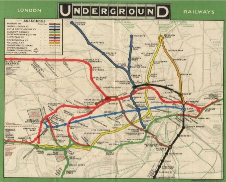
People needed to be able to navigate the new ‘underground train network’ that was the London Subway. So the powers that be made a map; a perfectly reasonable mess of complexity. It had each of the railway lines, all of the stops, it was colour coordinated, it showed near by landmarks, and it had a key. All of the things you would expect from a map. In fact all the things that the modern day tube map has. Except it was a confusing mess.

If you had five minutes to stop and study it you’d probably be fine. But if you you’re busy and need to get a train to work in the morning, you probably don’t want to spend that time. What happened to this map combines ‘recombination innovation’ and design theory in just a super elegant way.
Recombination innovation
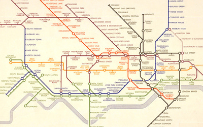
Recombinant innovation occurs when ideas from different areas come together to create something new. Here we see the world of cartography (map design) coming together with circuit design. In 1933, Harry Beck proposed the following design as an improvement on the last.

Instead of worrying about the geographical distances and topography, Harry drew inspiration from the circuit diagrams he made working as an electrical draughtsman (a job I am only now realizing still exists) on the subway. You can see his map is far more accessible despite actually having more information about the trains themselves.
Fun fact: the design was actually was initially rejected by the publicity department because it was ‘too radical’ but a successful trial print-run showed that it was what the public wanted.
Some design thinking
I’m not about to play spot the difference, because there are many, but let’s look at what both maps are trying to do. Effectively, people needed a way to navigate the underground. Navigation is well served with a map.
It’s undeniable that the original design is a solution to this problem. But let’s go a bit deeper and structure the problem like a user story for convenience:
As a commuter, I want to know which train to get, so that I can get to where I need to go.
Let’s look at this and break it down. How can we solve for this goal? What information does the user need in order to achieve their goal? They need to know about trains, and they need to know where the trains are going. So maybe the better question is, what information does the user not need in order to achieve their goal?
They don’t need the distance between stations, or the landmarks around them, or the exact layout of the tracks. Maybe that would be useful information to have maybe but is it necessary?
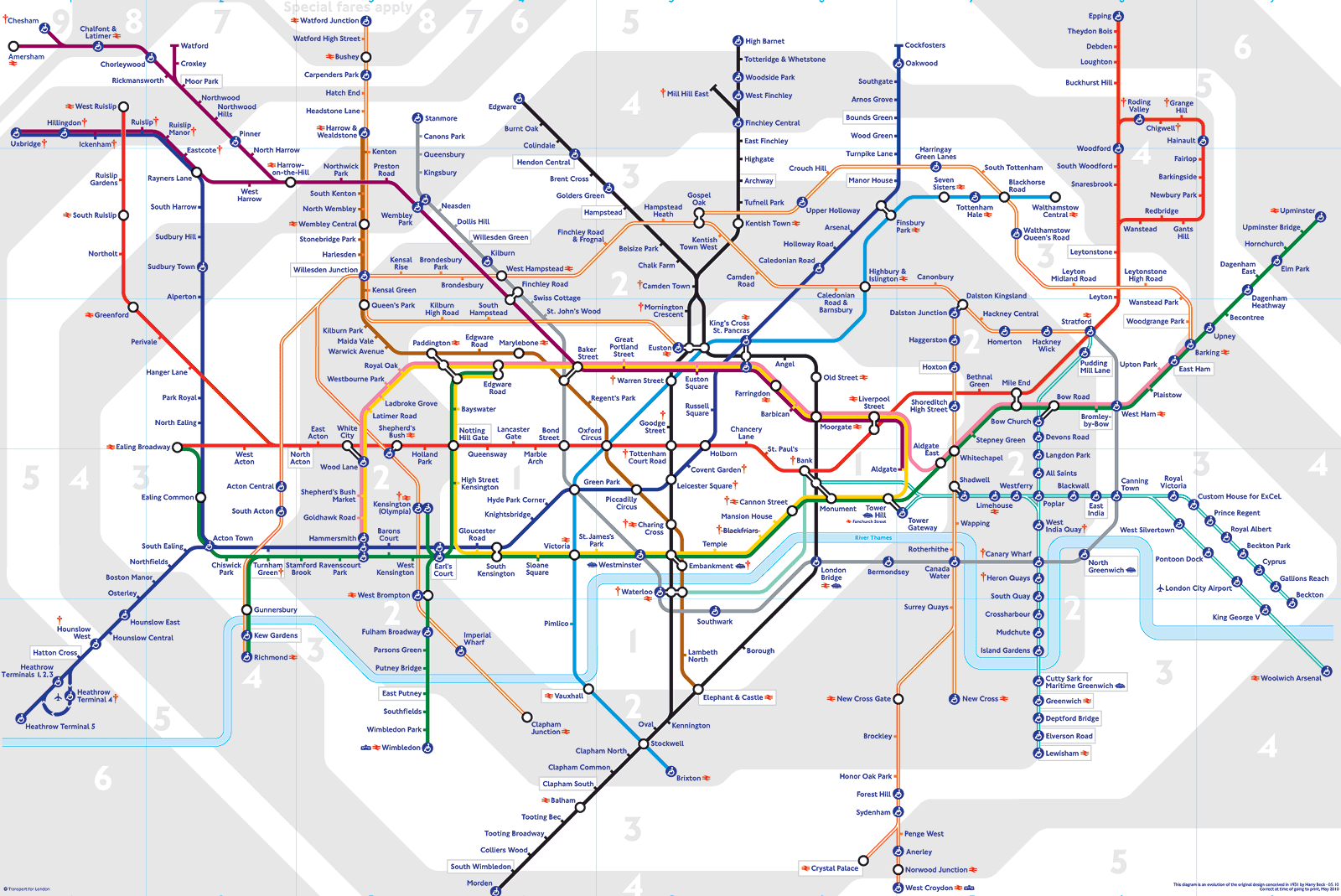
What Harry Beck, knowingly or not, did was removed the unnecessary complexity from the original map and strip it down to only the information that people actually needed. Plus, he did it using a design system (circuit design) that is well practiced at rendering horribly complicated stuff to be human readable. And since then, we’ve come to this:

Is it better do you think?
So what?
National geographic tells us that ‘a map is a symbolic representation of selected characteristics of a place, usually drawn on a flat surface.’ I wonder if this definition was influenced by the subway maps of the world.
I thought this was an interesting story that people would be interested in and I want to raise more awareness for these modes of thinking, ‘recombination innovation’ and design thinking that aims to remove complexity.
The New York city tube also has an interesting story associated with it, maybe I’ll do that one too some day.
